Project HelloPsych: Designing a User-Centric Platform for Mental Health Experts
Overview
HelloPsych is a global platform that connects mental health experts worldwide, providing a space for professionals to collaborate, share knowledge, and offer services. The platform aims to create an accessible, user-friendly environment where mental health experts can network, expand their reach, and enhance their practice.
My Role
As the User Experience Designer for HelloPsych, my responsibilities focused on enhancing the platform’s usability and navigation to ensure an intuitive and engaging user experience. My key activities included:
- Designing the menu navigation flows to create a seamless user journey throughout the platform.
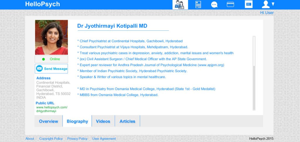
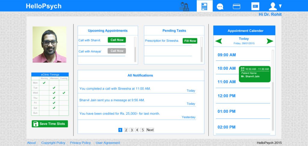
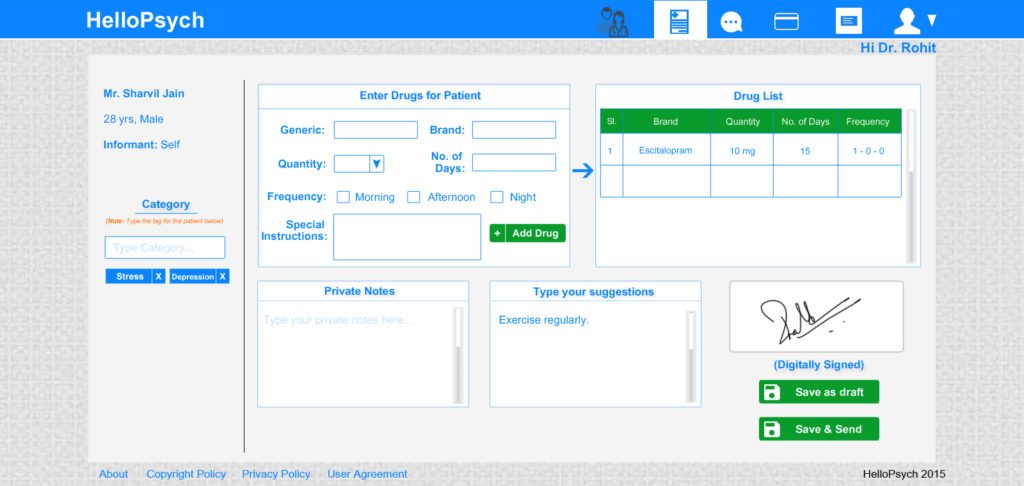
- Creating interactive wireframes for clients to interact with and provide feedback, ensuring the design aligned with their needs and expectations.
- Collaborating closely with the development team to ensure the website was developed following the designed wireframes, maintaining consistency and functionality.
Approach
- Designing menu navigation flows: I started by designing the menu navigation flows using Draw Express and XMind to map out the optimal paths for users to access key features and services on the platform. This involved understanding the various user roles and creating a logical, intuitive structure that catered to their needs.
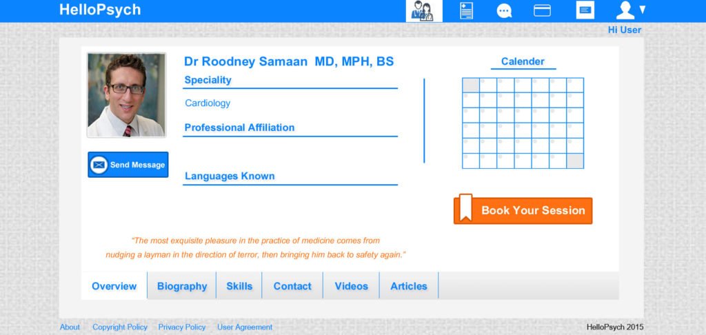
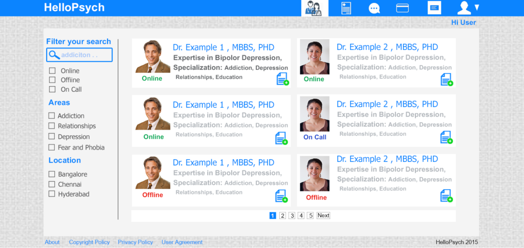
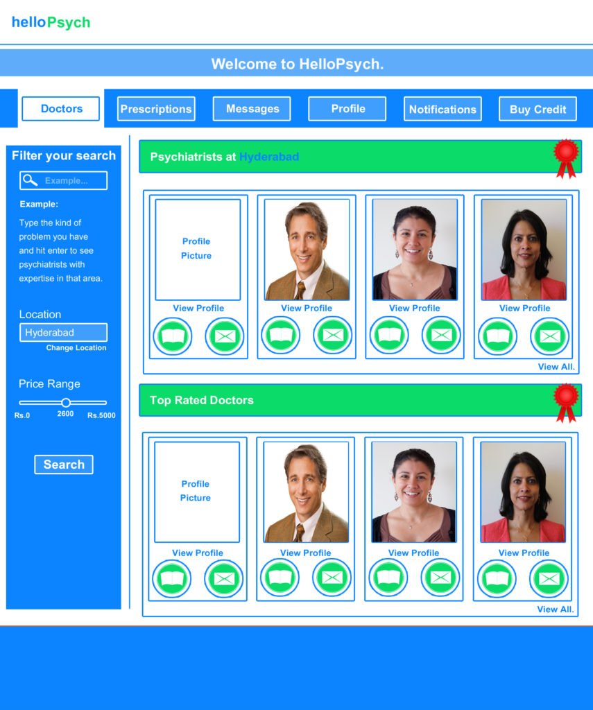
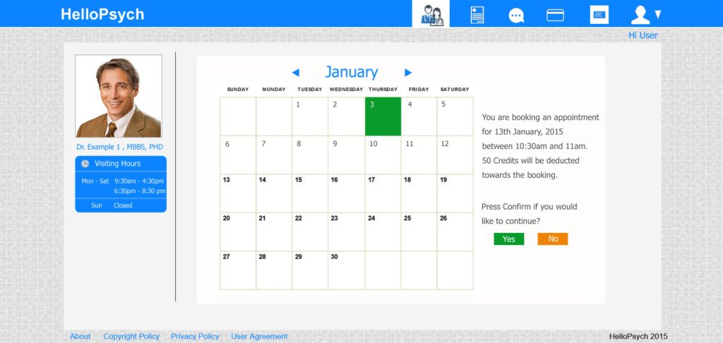
- Creating interactive wireframes: Using Photoshop and Axure, I developed detailed wireframes and interactive prototypes that allowed clients to experience the proposed design in action. These wireframes helped visualize the user journey and allowed stakeholders to engage with the design and give constructive feedback.
- Collaboration with the development team: I worked closely with the development team, providing clear guidance and ensuring alignment between the design and development phases. This collaborative effort ensured the website was built according to the established wireframes, preserving the intended user experience and functionality.
Methodology
I applied an Agile approach to both the design and development phases. This allowed for iterative feedback and continuous improvement, ensuring that the design was refined in response to stakeholder input and evolving project requirements.
Tools Used
- Draw Express and XMind: For designing and mapping menu navigation flows.
- Photoshop: To create static wireframes, visually representing the website’s layout and elements.
- Axure: To develop interactive wireframes, enabling clients to test and provide feedback on the navigation and usability of the platform.
Impact
The redesigned menu navigation and user interface significantly enhanced the usability and accessibility of the HelloPsych platform. By creating an intuitive and well-structured user journey, I helped ensure that mental health experts could easily navigate the platform, connect with peers, and access resources effectively. The interactive wireframes allowed for meaningful client feedback, which guided the final development, resulting in a platform that met user needs and expectations.
